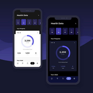
Circular Progress Bar with UIKit on iOS
Step-by-step guide on implementing a circular progress bar with UIKit, including custom views, layers, bezier paths, and engaging animations

In this tutorial, we will learn how to implement a circular progress bar using UIKit. This step-by-step guide will take you through creating a custom UIView subclass, defining custom layers, working with bezier paths, and adding custom progress animations.
Let’s get started!

Step 1: Create a New UIView Subclass
First, we need to create a new UIView subclass called CircularProgressBarView. This class will handle the drawing and animation of the circular progress bar.
import UIKit

final class CircularProgressBarView: UIView {

}
By subclassing UIView, we can customize its drawing behavior and add custom sublayers for our circular progress bar.
Step 2: Define Appearance Constants
Next, let’s define the constants for the appearance of the progress bar. This includes the line width and progress bar colors. Constants help in easily updating and maintaining the appearance settings.
import UIKit

final class CircularProgressBarView: UIView {

    // MARK: - Constants

    private struct Appearance {
        static let lineWidth: CGFloat = 10.0
        static let backgroundColor = UIColor.gray
        static let progressColor = UIColor.systemBlue
    }
}
Step 3: Setup Layers
Next, we need to add two CAShapeLayer instances to our view: backgroundLayer and progressLayer. The backgroundLayer will represent the complete circle, while the progressLayer indicate the current progress.
import UIKit

final class CircularProgressBarView: UIView {

    // MARK: - Constants

    private struct Appearance {
        static let lineWidth: CGFloat = 10.0
        static let backgroundColor = UIColor.gray
        static let progressColor = UIColor.systemBlue
    }

    // MARK: - Layers

    private lazy var progressLayer: CAShapeLayer = {
        let layer = CAShapeLayer()
        layer.lineWidth = Appearance.lineWidth
        layer.lineCap = .round
        layer.strokeStart = 0
        layer.strokeEnd = 0
        layer.fillColor = UIColor.clear.cgColor
        layer.strokeColor = Appearance.progressColor.cgColor

        return layer
    }()

    private lazy var backgroundLayer: CAShapeLayer = {
        let layer = CAShapeLayer()
        layer.lineWidth = Appearance.lineWidth
        layer.lineCap = .round
        layer.strokeStart = 0
        layer.strokeEnd = 1
        layer.fillColor = UIColor.clear.cgColor
        layer.strokeColor = Appearance.backgroundColor.cgColor

        return layer
    }()
}
Step 4: Add Layers to the View
Now, we need to add these layers to our view.
import UIKit

final class CircularProgressBarView: UIView {

    // MARK: - Constants

    private struct Appearance {
        static let lineWidth: CGFloat = 10.0
        static let backgroundColor = UIColor.gray
        static let progressColor = UIColor.systemBlue
    }

    // MARK: - Layers

    private lazy var progressLayer: CAShapeLayer = {
        let layer = CAShapeLayer()
        layer.lineWidth = Appearance.lineWidth
        layer.lineCap = .round
        layer.strokeStart = 0
        layer.strokeEnd = 0
        layer.fillColor = UIColor.clear.cgColor
        layer.strokeColor = Appearance.progressColor.cgColor

        return layer
    }()

    private lazy var backgroundLayer: CAShapeLayer = {
        let layer = CAShapeLayer()
        layer.lineWidth = Appearance.lineWidth
        layer.lineCap = .round
        layer.strokeStart = 0
        layer.strokeEnd = 1
        layer.fillColor = UIColor.clear.cgColor
        layer.strokeColor = Appearance.backgroundColor.cgColor

        return layer
    }()

    // MARK: - Lifecycle

    init() {
        super.init(frame: .zero)
        loadLayout()
    }

    required init?(coder: NSCoder) {
        fatalError("init(coder:) has not been implemented")
    }

    // MARK: - Layout

    func loadLayout() {
        layer.addSublayer(backgroundLayer)
        layer.addSublayer(progressLayer)
    }
}
Step 5: Apply Circular Path to Layers
Next, we need to define the circular path using UIBezierPath in the layoutSubviews() method. This path is then assigned to both backgroundLayer and progressLayer.
import UIKit

final class CircularProgressBarView: UIView {

    // MARK: - Constants

    private struct Appearance {
        static let lineWidth: CGFloat = 10.0
        static let backgroundColor = UIColor.gray
        static let progressColor = UIColor.systemBlue
    }

    // MARK: - Layers

    private lazy var progressLayer: CAShapeLayer = {
        let layer = CAShapeLayer()
        layer.lineWidth = Appearance.lineWidth
        layer.lineCap = .round
        layer.strokeStart = 0
        layer.strokeEnd = 0
        layer.fillColor = UIColor.clear.cgColor
        layer.strokeColor = Appearance.progressColor.cgColor

        return layer
    }()

    private lazy var backgroundLayer: CAShapeLayer = {
        let layer = CAShapeLayer()
        layer.lineWidth = Appearance.lineWidth
        layer.lineCap = .round
        layer.strokeStart = 0
        layer.strokeEnd = 1
        layer.fillColor = UIColor.clear.cgColor
        layer.strokeColor = Appearance.backgroundColor.cgColor

        return layer
    }()

    // MARK: - Lifecycle

    init() {
        super.init(frame: .zero)
        loadLayout()
    }

    required init?(coder: NSCoder) {
        fatalError("init(coder:) has not been implemented")
    }

    // MARK: - Layout

    func loadLayout() {
        layer.addSublayer(backgroundLayer)
        layer.addSublayer(progressLayer)
    }

    override func layoutSubviews() {
        super.layoutSubviews()

        let circlePath = UIBezierPath(
            arcCenter: CGPoint(x: bounds.midX, y: bounds.midY),
            radius: (bounds.width - Appearance.lineWidth) / 2,
            startAngle: -CGFloat.pi / 2,
            endAngle: CGFloat.pi * 3 / 2,
            clockwise: true
        ).cgPath

        backgroundLayer.path = circlePath
        progressLayer.path = circlePath
    }
}
We create a circular bezier path which defines the shape of our progress bar. By specify the angles -CGFloat.pi / 2 to CGFloat.pi * 3 / 2 we create a full circle starting from the top. We also adjust the radius to account for the line width, ensuring the circle fits within the view’s bounds. Assigning the path to both layers ensures they follow the same circular path.
Step 6. Set progress
Next, we need to add a method to set current progress in our view.
import UIKit

final class CircularProgressBarView: UIView {

    // MARK: - Constants

    private struct Appearance {
        static let lineWidth: CGFloat = 10.0
        static let backgroundColor = UIColor.gray
        static let progressColor = UIColor.systemBlue
    }

    // MARK: - Layers

    private lazy var progressLayer: CAShapeLayer = {
        let layer = CAShapeLayer()
        layer.lineWidth = Appearance.lineWidth
        layer.lineCap = .round
        layer.strokeStart = 0
        layer.strokeEnd = 0
        layer.fillColor = UIColor.clear.cgColor
        layer.strokeColor = Appearance.progressColor.cgColor

        return layer
    }()

    private lazy var backgroundLayer: CAShapeLayer = {
        let layer = CAShapeLayer()
        layer.lineWidth = Appearance.lineWidth
        layer.lineCap = .round
        layer.strokeStart = 0
        layer.strokeEnd = 1
        layer.fillColor = UIColor.clear.cgColor
        layer.strokeColor = Appearance.backgroundColor.cgColor

        return layer
    }()

    // MARK: - Lifecycle

    init() {
        super.init(frame: .zero)
        loadLayout()
    }

    required init?(coder: NSCoder) {
        fatalError("init(coder:) has not been implemented")
    }

    // MARK: - Layout

    private func loadLayout() {
        layer.addSublayer(backgroundLayer)
        layer.addSublayer(progressLayer)
    }

    override func layoutSubviews() {
        super.layoutSubviews()

        let circlePath = UIBezierPath(
            arcCenter: CGPoint(x: bounds.midX, y: bounds.midY),
            radius: (bounds.width - Appearance.lineWidth) / 2,
            startAngle: -CGFloat.pi / 2,
            endAngle: CGFloat.pi * 3 / 2,
            clockwise: true
        ).cgPath

        backgroundLayer.path = circlePath
        progressLayer.path = circlePath
    }


    // MARK: - Public

    func setProgress(_ progress: CGFloat) {
        // Ensure progress is between 0 and 1
        let clampedProgress = max(min(progress, 1), 0)

        progressLayer.strokeEnd = clampedProgress
    }
}
Step 7. Add progress animation
To make our progress bar more engaging, we should add the ability to set progress with animation. Let’s add a parameter to our method where we set the progress value.
import UIKit

final class CircularProgressBarView: UIView {

    // MARK: - Constants

    private struct Appearance {
        static let lineWidth: CGFloat = 10.0
        static let backgroundColor = UIColor.gray
        static let progressColor = UIColor.systemBlue
    }

    // MARK: - Layers

    private lazy var progressLayer: CAShapeLayer = {
        let layer = CAShapeLayer()
        layer.lineWidth = Appearance.lineWidth
        layer.lineCap = .round
        layer.strokeStart = 0
        layer.strokeEnd = 0
        layer.fillColor = UIColor.clear.cgColor
        layer.strokeColor = Appearance.progressColor.cgColor

        return layer
    }()

    private lazy var backgroundLayer: CAShapeLayer = {
        let layer = CAShapeLayer()
        layer.lineWidth = Appearance.lineWidth
        layer.lineCap = .round
        layer.strokeStart = 0
        layer.strokeEnd = 1
        layer.fillColor = UIColor.clear.cgColor
        layer.strokeColor = Appearance.backgroundColor.cgColor

        return layer
    }()

    // MARK: - Lifecycle

    init() {
        super.init(frame: .zero)
        loadLayout()
    }

    required init?(coder: NSCoder) {
        fatalError("init(coder:) has not been implemented")
    }

    // MARK: - Layout

    private func loadLayout() {
        layer.addSublayer(backgroundLayer)
        layer.addSublayer(progressLayer)
    }

    override func layoutSubviews() {
        super.layoutSubviews()

        let circlePath = UIBezierPath(
            arcCenter: CGPoint(x: bounds.midX, y: bounds.midY),
            radius: (bounds.width - Appearance.lineWidth) / 2,
            startAngle: -CGFloat.pi / 2,
            endAngle: CGFloat.pi * 3 / 2,
            clockwise: true
        ).cgPath

        backgroundLayer.path = circlePath
        progressLayer.path = circlePath
    }

    // MARK: - Public

    func setProgress(_ progress: CGFloat, animated: Bool) {
        // Ensure progress is between 0 and 1
        let clampedProgress = max(min(progress, 1), 0)

        if animated {
            let animation = CABasicAnimation(keyPath: "strokeEnd")
            animation.fromValue = progressLayer.strokeEnd
            animation.toValue = clampedProgress
            animation.duration = 0.5
            animation.timingFunction = CAMediaTimingFunction(name: .linear)
            progressLayer.removeAnimation(forKey: "progress")
            progressLayer.add(animation, forKey: "progress")
        }

        progressLayer.strokeEnd = clampedProgress
    }
}
Step 8: Using CircularProgressBarView
Finally, we can use our CircularProgressBarView in a view controller.
import UIKit

class ViewController: UIViewController {

    private lazy var circularProgressBarView = CircularProgressBarView()

    override func viewDidLoad() {
        super.viewDidLoad()

        view.addSubview(circularProgressBarView)

        circularProgressBarView.setProgress(0.75, animated: true)
    }

    override func viewDidLayoutSubviews() {
        super.viewDidLayoutSubviews()

        circularProgressBarView.frame = CGRect(
            x: view.bounds.midX - 125,
            y: view.bounds.midY - 125,
            width: 250,
            height: 250
        )
    }
}
Conclusion
With these steps, you now have a fully functional circular progress bar in your iOS app using UIKit. You can customize it further to fit your needs, such as changing colors, line widths, or adding additional animations.
Thank you for reading until the end. If you have any questions or feedback, feel free to leave a comment below.
If you enjoyed reading this article, please press the clap button 👏 . Your support encourages me to share more of my experiences and write more articles like this. Follow me here on medium for more updates!
Happy coding! 😊👨💻👩💻
More from Ruslan Dzhafarov